friday
2 comments
This is from a couple months ago, but I just found it now, and it's amazing:
This is from a couple months ago, but I just found it now, and it's amazing:
Excuse the design wonkery, but msnbc.com's new story pages are amazingly ambitious.
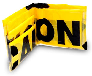
need to kill time before friday cocktails?
here look at these!
or, how about these!
you. are. welcome. -- FB
You know how architecture blogs always seem to have impossibly cool futuristic images? Most of those images are renders. They haven't been constructed yet and probably never will be. Also, renders are marketing material. These images portray a building in the best possibile circumstances, but due to weather and you know, gravity, a lot can happen between the sketch and completion of a building. More from Will Wiles on why we shouldn't yet make too much of Anish Kapoor's wtf ArcelorMittal Orbit render for the London Olympic village.-JM
I didn't see much chatter about this New Yorker profile of Polyvore last week, but parts of it were pretty interesting, especially the bits about it being founded by the creator of Yahoo Pipes (!) and his rather unsexy reason for creating Polyvore:
I felt that it would be great to work on something that has a visual component. If you look at all the different types of visual media, images are the ones your brain processes the fastest.
Anyway, the whole data-invasion-of-the-fashion-world theme is an interesting recurring idea out there right now... Update: Lindsay thought the profile was dumb (she's right about cringing at that "usability testing" bit).
The illustrator Robert McCall has died. McCall was notable for his ambitious visions of space exploration. According to a note on MAKE, Isaac Asimov said he was the "nearest thing to an artist in residence from outer space." If you spent time as a kid reading a lot of theoretical magazine articles about space stations and manned missions to Mars, you probably ran across his work. (He also did the poster art and other materials for 2001: A Space Odyssey.) Here are a few scans from an April 1961 issue of Life magazine, published right after Yuri Gagarin's successful mission sent America into a panic and McCall's illustrations helped us feel like we actually had a plan. --ADM
Designers will enjoy this four-question survey from Pentagram: What Type Are You? The password to get in is character.
If you're the kind of person who's intrigued by tv graphics and branding, then this explanation of the NBC color case study will interest you. (I've read the NBC design style guide several times, and one of the first rules is "Don't mutilate the peacock," which somehow these guys were able to do.)
Bonnie Fuller has finally launched the first salvo in her attempt to cross over to new media: HollywoodLife.com. It is in the running for worst website design of the year.
CNN.com redesign. Nice evolution, includes a feature that blows out "most popular" called NewsPulse and interesting use of inline video.
If you watched the VMAs last night, here's that Twitter visualization that iJustine was showing off. It's by Stamen and Radian 6.
In the category of "If you like X, then you'll like Y" and X = Mad Men... Art & Copy trailer.
Two new redesigns today show the extremes of news design (and cultural perception of news?): LAtimes.com and Newsday. [via]
Lady Gaga: Architecture Personified? I ask not in jest, is there anyone trying harder to bring the avant-garde to the mainstream? (Actually, are we allowed to use the term "avant-garde" any more?)
I finally redesigned this dumb blog. Yay! There's still some clean-up work to be done, but drop a note in the comments if you see anything amiss. (LOOK AT THE BIG SCARY VIRUS GRAPHIC THAT'S GOING TO EAT THE INTERNET!) Update: I've made many changes based upon some feedback. And I made the logo even uglier, just to piss off that one guy. (I'll probably tweak that later this week.)
Financial Times: The history of the Times New Roman typeface. Authorial dispute!
I'm surprised it took Starbucks this long to experiment with spinoffs, but is the whole rustic thing really the right direction?
WhatChuckWore.Tumblr.Com. The outfit he wore to shoot hoops was the best. [via]
WSJ profiles Vincent Connare, the creator of Comic Sans. At ROFLcon NYC a few month back, he found the perfect tone of humor and self-deprecation about his odd claim-to-fame.
Monocle, that ridiculously expensive magazine, opened a ridiculously expensive store London, and is planning new stores in Los Angeles and Tokyo this year.
Kinda cool from NYTimes.com: Article Skimmer. Much better than navigating the homepage, right? [via]
Oddly engaging: Pretty Loaded, a gallery of Flash pre-loading graphics. [via]
Trailer to Objectified, a documentary about industrial design, from the makers of Helvetica.
I snapped some pictures of the neon signs sprinkled around the party for The Atlantic's redesign a couple weeks ago. Now the mag has launched Think Again, which aggregates the various neon interrogatives (Is Porn Adultery? Is Google Making Us Stupid?) onto a blog that is "devoted to the idea that asking questions leads us to better answers." [via]
Kottke gathers the relevant links on The Atlantic redesign -- print and online.
NYC imports from Japan which imported from Victorian England: New York Lolitas, an NYT audio slideshow (more). The interviews are strangely fascinating. They hang out in Chinatown, there's a Meetup Group, and the beginnings of a documentary.
Redesigned: WSJ.com & Time.com. A race to boring. Update: Some WSJ.com reviews: Portfolio | PaidContent | Radar.
BrandNew looks at Metallica, the brand. New logo from the guy who did Coke, Palm, Amazon, Dolby, etc.
I know some seriously uptight people who are seriously gonna freak out about this very serious issue: The font used in the credits of Mad Men is Arial, not Helvetica.
Through a circuitous route, Katie Bakes discovers the "magnum opus on Pen & Pixel." (Example: "This is just a cornucopia of photo-shopped crappiness. Pyramids sit next to crashed space shuttles. Vultures stalk used Chevy Cavaliers. Mysterious floating direction signs. The secrets of the Illuminati can be discerned from studying the mysteries of this cover.") The Houston-based design firm notoriously pioneered the tricked out album cover style prevalent in so many '90s rap albums. It concludes with a video of Louis Theroux interviewing a Pen & Pixel designer.
CNN.com introduces BackStory, which uses coverflow (a display type popularized by iTunes) to historically navigate news stories. Like Jeff, I'm not sure coverflow works here, but the organizational technique is an interesting advance for news narratives.
Someone mentioned to me a couple weeks ago that Radar was doing a print redesign. I joked that they probably wasted a million bucks on Pentagram. The funny thing is, I was right. (Okay, I don't know how much it actually was, and I don't hate Pentagram. But I bet it was too much, and I think Pentagram is overrated.)
Designers: NYMag.com design director gig has opened. Consult with Stuff Designers Like before applying.
Wishing I could get referral residuals on this link, because I know several people who will buy it: turntable watch.
I've been trying to link to Tufte's take on the iPhone all week, but their server keeps crashed. Now they've thankfully moved the best part -- the video -- to a different page.
One of my favorite new finds is the blog Sleevage, which does analysis of album cover art from the past and present. Today it posted about Duran Duran's Rio, designed by Patrick Nagel who of course personified pretty much every visually tacky stereotype of the '80s.
Infosthetics' 20 most wanted Christmas gifts for the info-addicted. (I already own nearly a third of these, which totally weirds me out.)
For the designers out there, I just noticed the ScientificAmerican.com has redesigned, and it's full of interesting little visual features.
I've hedged away from criticizing or adoring Kindle, but I'm amused by Chip Kidd's answer to whether or not it will change book cover design.
I realize it's like we're on 24/7 Kanye watch around here lately, but this link tops all of them: Kanye West's house in Interior Design magazine. Money quote: "It's been my dream to be in Interior Design." Or maybe this one: "The kitchen is definitely dope." Whatever -- just check out the slideshow. Dammit, now I need an aquarium in my bathroom. [via]
Remember when every major magazine started doing "design issues" several years ago? That's so 2000 -- now we're onto fonts. For instance, NYT Mag's story (and slideshow) on the new highway roadsign font, Clearview, is so fawning in its praise that non-designers will likely chuckle their way through. However, it will no doubt have its own movie someday.
This is the most inspirational thing I've seen this year: an infographic of every emotional relationship I've had. Want one! [via]
I sorta hate designers, even though I sorta am one. It's because they really are like this: Designer//Slash//Model. [via]
You know we've entered a new era when someone seriously asks writers (Jonathan Lethem, Nicholson Baker, Richard Posner, etc.) to talk about their favorite font. [via]
The New York Observer did an interesting piece a few weeks ago that asked how organizational design influences the news-generation process. One of my 37 unfinished book proposals actually looks closely at this idea by analyzing how media companies organize themselves spatially and hierarchically. (If this sounds uninteresting to you, then you have a better insight into why all these book proposals are "unfinished.") This general notion has been on people's minds recently because a) several companies are trying to converge their online units with their traditional print/broadcast units, and b) the New York Times is moving into a new building (which makes Khoi giddy). Anyway, this post has no point, except to say: I wish writing books was easy.
Joy Division sneakers (New Balance), Tribe Called Quest sneakers (Puma)... what else? Updates from the comments: Dinosaur Jr. sneakers (Nike), Jackass sneakers (Chuck Taylors), Jay-Z and 50 Cent sneakers (Reeboks), and Spike Lee sneakers (Nike).
I haven't seen it yet, but Pentagram redesigned Time magazine and it looks pretty sharp. [via]
The cover art of the new Borat DVD (out Tuesday) is designed to make it look like a bootleg. [via]
A strangely compelling gallery of control room photos with large screens of data porn.
More hot typography action (but cooler than that sounds): What does Marsellus Wallace look like? [via]
More cool attempts at personal data visualization: Feltron Seven 2006 Annual Report. [via]
Marginal Revolution: What is the worst designed everyday object? Discuss. (I'd also vote for the jewel case, but not the case itself; rather, the plastic adhesive label that gets pasted over it. Even though it says "Pull To Remove," I'm pretty sure that's a form of sarcasm.)
So here's the Nooka watch that I've been sporting lately. I like it because it visualizes time in a different way: spatially, with bar graphs. But today I discovered this new Frank Gehry watch which takes a completely different visualization: verbally, like how we talk about time.
I don't usually point out design portfolios, but this futurist, fascist, globalist, militaristic, festishist site weirds me out: ImAllFake.